Challenge Winning cards

Saturday, April 28, 2012

Geordie Pride

I'm always being asked to make football related cards for men - the North East of England is a hotbed of passion when it comes to footie! Usually the cards are Sunderland or Newcastle related and today's card is for the brother of my best friend - a mad Newcastle fan who lives in Sunderland ( I think he was dropped on his head as a child!!!)


The main image is made by carefully cutting out sections of the badge and decoupaging and matting it. I've kept the lines very clean so that the badge really stands out.

I've entered this card into the challenge at Daring Cardmakers who want a 'masculine card with a sporting theme'.

Friday, April 27, 2012

Dad in the Garden

The challenge at My Time To Craft this week is 'Gardening Gems' - make a card with a gardening theme. This prompted me to use a digi I've been looking forward to using for a while - a freebie from Paper Printables


This was lovely to colour - the trickiest part was decoupaging the flowers on the trellis. I've chalked the base card under the image in a pale green colour to make the image stand out.

Tuesday, April 24, 2012

Wild Thing...

Needing a birthday card for a teenage girl who loves animal prints, I  got my inspiration for this card from a blogger and designer whose work I greatly admire - Katina Killey at Katina's Cards and Chat - I do hope she doesn't mind and takes this as a compliment as intended. She made a couple of gorgeous cards using some delightful images from Pink Petticoat.


I've used the same image layout that I've used many times in the past and I've combined the shoes from Katina's card with a different handbag from the Diva Doodles range of images. The patterned paper is some zebra print paper that came some time ago with a magazine. The actual card is huge for me - it's 8 x 8 - I could get used to working on this size of card.

Thursday, April 19, 2012

Pinks and Oranges


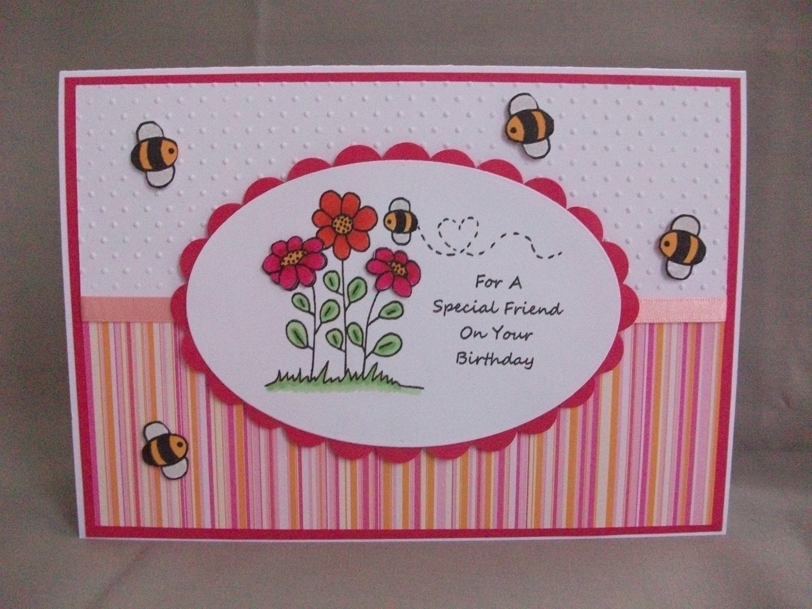
Bright cerise pink and orange is one of my favourite colour combinations and this week's challenge at The Play Date Cafe asks us to use these very colours...


I love that tie! The card I've made was at the request of a friend who wanted something pink with bees on it. I've had this image for a while - I don't know where it's from as the file is just named 'bees and flowers' and no clue to the author. I've coloured it with promarkers, decoupaged the flowers and enlarged and cut out some more of the bee images to use to fly about the card. The stripey paper is very old Doodlebug stock.


Tuesday, April 17, 2012

A Touch of Doodling

This week's challenge at Less is More was a combination of two things way left of my comfort zone - one layer AND doodling. Now I've done one layer cards before and I've added doodling in it's basic form - as faux stitching but the two things made me nervous!


First I found a digi that lent itself to adding a bit of pattern - it was a freebie from Wendymade blog some time ago and I've used it decoupaged on a number of occasions. I kept the whole thing simple, coloured one heart with a lilac promarker and then just criss-crossed the heart in a patchwork effect. I'm not sure whether it is TOO clean and simple but I really kept myself in check even though I was itching to add some bling!

Saturday, April 14, 2012

Paper Pieced Man's Card (well...nearly a man!)

I've been up with the larks today - I have so much to do. While the house was quiet I've managed to get a card made for a young man who is 17 next week. This is probably the age I find most difficult for the men - cards for small boys can be cute monsters etc and grown up male cards usually involve beer or sport.

As Jack is the kind of lad who loves his music and is always seen in scruffy jeans and hoodies I thought this paper pieced image was ideal. I don't know where the image is from - it was a freebie I found through a freebie blog. The background is just random sheet music downloaded fron the internet - it's probably classical and totally unsuitable!

I've entered this card into the following challenges:

Secret Crafter - Make a man's card.
Crafty Emma's - Paper piece it

Friday, April 13, 2012

Pink Spring Flowers

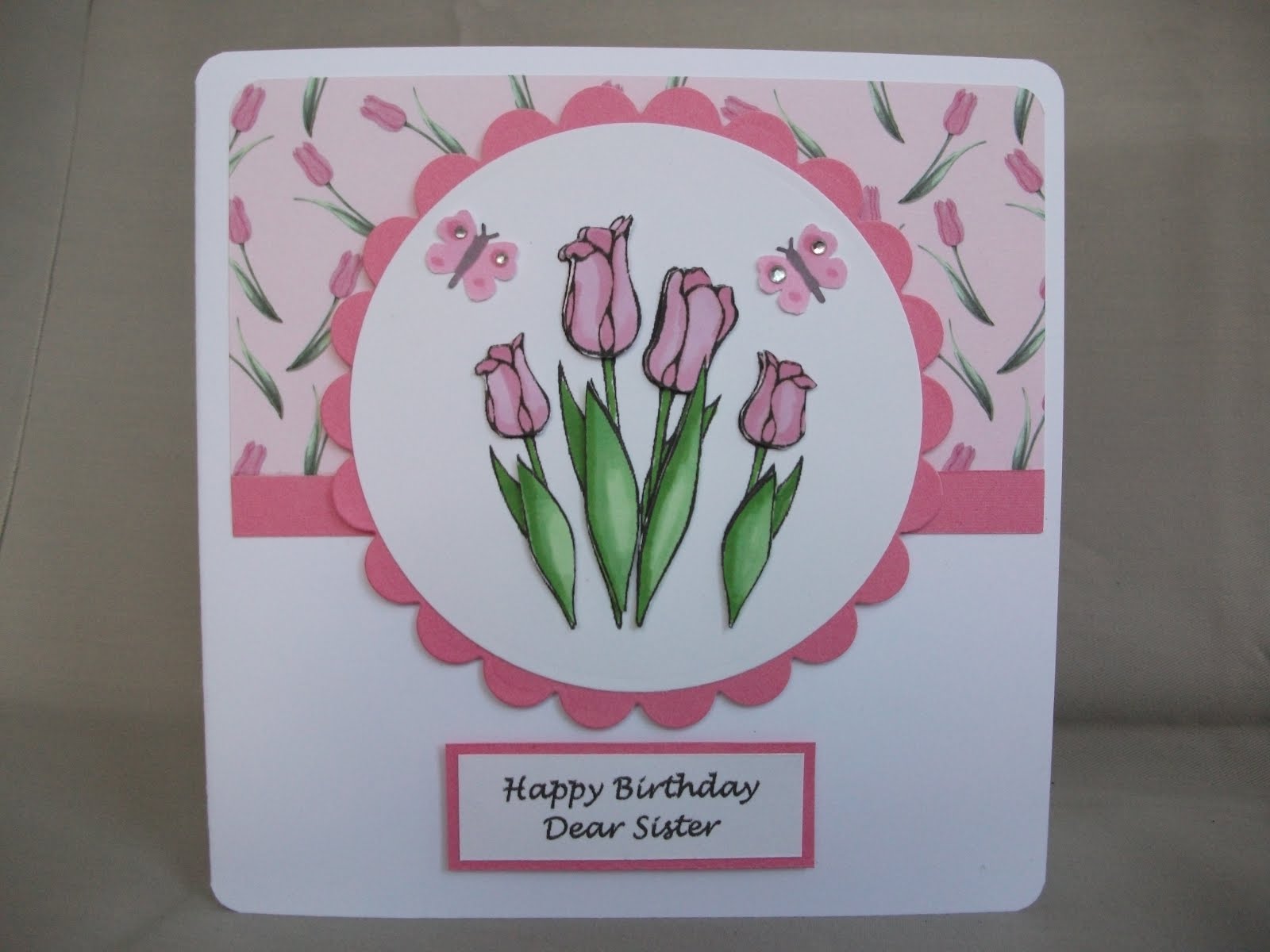
The challenge at Cute Card Thursday this week is to use spring flowers on your card and needing a card for a colleague's sister I decided to use this lovely tulips image which is a colouring page I found some time ago. It's coloured using promarkers and I've decoupaged the front leaves and the flower heads. I got the backing paper a couple of years ago in Making Cards magazine and it matches perfectly.


I've added some punched butterflies which I thought would add extra texture and interest but now wish I hadn't cos they don't look right! I'm not feeling any love for my cards at the moment!

I've also entered this card into the challenge at Polka Doodles - Pretty in Pink. It's soooo easy to use pink on cards!

Tuesday, April 10, 2012

First Christmas Card...

The challenge at Less Is More this week is a colour challenge - to use three different shades of green on your card. I've missed the last couple of challenges through being on holiday so this is a lovely way to get back into the swing of things - green is probably my favourite colour. And there's no better colour to use for making a start on Christmas cards!


The image used is a freebie I've had for a while from Paper Squirrel's blog. I love the image and the way it decoupaged very easily but I'm left thinking there's something missing from the card.

Saturday, March 17, 2012

Three In A Row

Great to see the three in a row challenge at the Allsorts Challenge Blog this morning as it fits perfectly the Mother's Day card I have made for my partner's mam. As usual he left it to the last minute to ask me for it so I've just finished adding the diamantes to it 10 minutes ago!


I've kept it very simple as last minute cards usually are!. The butterflies are punched in various shades of purple, mounted on a circle then added to a long A5 card blank. Not the most exciting card I've ever made but because it's made on very white linen effect card it has an 'expensive' feel to it!

Thursday, March 15, 2012

Special Lady

The challenge at Moving Along With the Times this week is to make a card for a 'Special Lady' - my Nanna! She loves roses so this decoupaged rose was the perfect topper.

I mounted it on an oval nestie but not having a scallopped oval nestie for a border, I used lots of punched yellow circles and carefully stuck them round the edge. I'm pleased with the effect. The patterned papers came from a magazine and I've added some yellow coloured card candy for extra texture.

Tuesday, March 13, 2012

Another card for Mother's Day

Here's another clean and simple card for Mother's Day, again using the flower die that has sat in a box unloved for over a year - it's now my new favourite die. If I have a good sort out who knows what other goodies I would find!


The striped paper is also very old - it came free with a Simply Cards and Papercraft magazine about 5 years ago - I hoard EVERYTHING!
It matches the colours used in the flower perfectly.

I've enterd this card into the following challenges...

Papertake Weekly Challenge - For The Girls....Or Mum

Oldie But A Goodie Challenge - Mum's the word

Saturday, March 10, 2012

Mother's Day Paper Piecing

The current challenge over at the Corrosive Challenge Blog is to make a card using the paper piecing technique. This is one of my favourite techniques - I love the effect of images coloured in with patterned papers.


The bag and shoe images are both from Pink Petticoat, a great place for cute girly images and sentiments. Using Microsoft Publisher, I arranged the images slightly overlapping and added the greeting with a text box (Worstveld Sling font). I then reprinted the bag image only onto some pretty floral Pink Petticoat paper and pieced this over the original image. The shoes are also decoupaged and are coloured with promarkers. I've finished the card by adding a cute pink bow.

I'm going to try and develop this style of card with other images as I'm really pleased with the result.

Friday, March 09, 2012

Colour Challenge at The Play Date Cafe

I love The Play Date Cafe Challenge blog - it always has such interesting colour combinations in it's challenges - this week it's a lovely combination of CHARCOAL, ASH and BUTTER. As I still need to do loads of Mother's Day cards I used these colours for a handbag card. This image from the Digistamp Boutique is one of my favourites.

I've matted the image onto a scallopped square, then onto an embossed background. I've decoupaged the flowers on the handbag and used diamantes in the middle of them. A matching buttercup yellow ribbon finishes the clean and simple look. I didn't have any paper of the right shade of yellow so for the matted edging, I coloured some white scraps with the same promarker that I used on the flowers so everything matched.

Thursday, March 08, 2012

Neutrals

The theme this week at Less Is More is a colour theme - NEUTRALS - use anything from off white to black with any shade of beige, brown or grey in between. The card I've made is for a work colleague who wanted a simple but 'touchy feely' card for her Grandparents 60th Wedding anniversary ( wow - 60 years!).


It's made using a lovely textured linen card with very pale beige accents. The paper used for the hearts and scallopped nestie started life as a shimmery envelope from one of my birthday cards - I recycle everything! The swirly embossing folder adds texture and I've added diamantes and a gossamer beige ribbon. I found a lovely verse on the interwebby for the inside...

May your

Diamond Anniversary

Be as special as

The day you said ‘I Do’.

Here’s to many more years

Of love and laughter together.


How sweet! Hope they like it.

Monday, March 05, 2012

Spring Has Sprung

Today's card has been made entirely from scraps - I picked out lots of spring pastels, punched flowers and added gems. Very simple but they make a great border. The backing paper is embossed using the Swiss Dots embossing folder and the number and greeting were done in Word.


I've entered this card into the following challenges:

Cupcake Craftroom - Spring Bouquet
Emerald Faerie Garden - Embossing
CES Challenge Blog - Flower Frenzy

Wednesday, February 29, 2012

Hoppy Leap Year!

Today's card is a bit strange - it's a birthday card for a woman who is frog mad. She collects anything froggy so for her 40th birthday card I didn't have to think too long about what image to use.


The image and papers came free with a magazine some time ago - there were loads of funky animal images which I never thought I would ever use but kept 'just in case'. I have this idea in my head that frogs have lumps all over them which spurred me to use the spotty papers and the stars were done using an XCut punch.

I've entered this card in the following challenges ...

Fab 'n' Funky - Use something that 'leaps'
Sassy Cheryl's Challenge - Seeing Spots

Sunday, February 26, 2012

Thirty!

The challenge at Less Is More this week is 'don't scrap it' - make a card using up some of those scraps that all good cardmakers collect...


My scraps are actually in pretty good order - I spent a happy afternoon over Christmas sorting all my scraps into colour order and putting them into plastic folders - well worth the effort 'cos you never know when you will need a tiny piece of turquoise paper and don't want to 'waste' a sheet of A4.


I found all of these scraps in my 'pink' folder - I think they are Doodlebug patterned papers from a couple of years ago. The letters are traced and cut by hand then matted onto plain cerise scraps and hand cut again to make a border. I really enjoy cutting - it's theraputic! The letters are attached with foam pads and I've finished off with a computer printed greeting. I've often made these 'word' cards - I got the idea from browsing through the card stands in Clintons - theirs cost about five quid - mine cost nothing!

Tuesday, February 21, 2012

Hot Pink

I've got loads of cards to make at the moment - the beginning of the year is a busy time for birthdays and with Mother's Day looming my order book is overflowing. Having loads of girly cards on order, the challenge at The Play Date Cafe caught my eye - use black and white and a splash of hot pink - the inspirational photo is gorgeous...


These colours work so well together! I was torn whether to do a handbag card or a shoe card and in the end this funky image from the Digi Stamp Boutique won the day. I used black and white spotty paper which started life as gift wrap, and used a magenta promarker to colour the shoe. Bright pink diamantes add to the girly feel of the card. I think I would actually wear shoes like this - honest!

Monday, February 20, 2012

Howzat!

I'm really enjoying making these clean and simple cards lately - I get so flustered trying to match papers with embellishments etc and I do love a bit of white space on my cards so I think you'll be seeing a lot more....


Today's card is for a clean and simple masculine card for the current challenge at Creative Card Crew. It's a birthday card for my partner's brother who is cricket mad. The paper and decoupaged image are from Papermania's It's a Man's World by Claire Curd.

Sunday, February 19, 2012

Less Is More - Punches or Die-cuts...

This week's challenge at Less Is More is to use punches or die-cuts on your card. I dug around in my dies case and found a lovely flower head and stem by Marianne Creatables that I had never used so decided to put it to the test...


I totally love it! Can't believe it's been there unused and unloved for over a year! I added some strips of co-ordinating striped paper I got from a magazine and some Papermania sticky letters coloured with a promarker and there's another Mother's Day card to add to the pile.