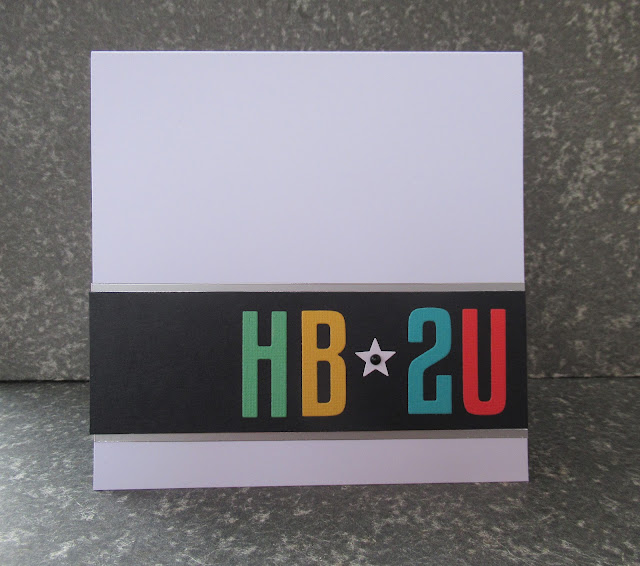
I desperately need more masculine cards for my box. I usually keep to a clean and simple style when making cards for men so seeing that Less Is More has started up again with the very broad theme of 'Birthdays' I was inspired to make this...
I've only used one third of the card leaving a load of clean white space - very CAS!
I've had the number/letter dies for so long I can't remember where they are from! And the coloured card are bits from my scraps box. I love the star between the letter - looks like something from an old Soviet propaganda poster! The only embellishments used are a tiny black plastic dot and two peel-off strips.
I'm playing along with the challenges at:
Less is More - showCASe
.
CAS on Friday #224 - Male - TOP 3
Thanks for visiting
Sharon
x
scrn l;


Really like the graphic style of this CAS card, cracking make
ReplyDeleteKathyk
CAS perfection, beautiful colors, clean layout, perfect proportion.
ReplyDeleteFantastic CAS masculine card! Thanks for playing along with us at Less is More.
ReplyDelete